The crest was the first thing on my list that I had to create, the reason for this is that all the other design elements going forward are going to utilise it, so it is important that I get this done first.
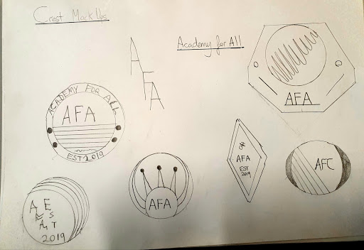
In the development of my designs for the academy crest I wanted to try out three different shapes because I could not decide on what would be the best one to go for. I decided to put it down to a vote, by sharing the 3 final designs as on reddit and facebook and see what people thought. Before I started to create any designs I set myself some goals, such as to make sure I incorporate elements of the LGBT flag, show male and female equality symbolic elements and to have the design be contemporary and memorable.
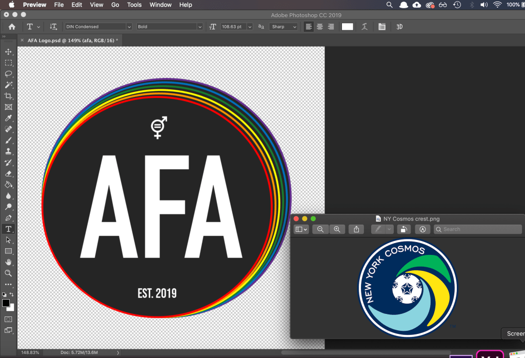
Below is my first design, I have taken some inspiration from the Wolves crest, which I kept open next to my work on Photoshop to use as a point of reference whilst I was creating the piece. I wanted to go for a simple design and not over fill it with unnecessary elements. I have met some of the goals I set myself as you can see from the thin rainbow strip that runs through the middle of the design and the M&F equality symbol at the bottom. The shape of the crest deviates slightly from the Wolves one I was inspired by, as my one has a point at the bottom rather than being flat.


The next crest I created was this diamond one, inspired by german club Werder Bremen. I really like the simplicity that is used in it, with the highlight of the additional inside diamond outline. As you can see below in the screenshot from when I was creating the crest, I also included this element. I liked the original way I was going with the design, however I felt it did not really get the message across of my academy and it couldn’t be interpreted right. I corrected this in the final crest you can see below, I have taken the elements from the first crest and put them into this one. This can be seen in the rainbow gradient used around the inside diamond outline, along with a more simplified text and the M&F equality sign.


I was quite happy with my designs at this point, however I did feel although they did lean a bit to the generic side as I felt as if they did not have any real standout elements, heading into my next design this was something I wanted to rectify. A design that I was fond of was the New York Cosmos one, even though I didn’t really use many elements from it, it did inspire me in terms of utilising swirls. I wanted to have the LGBT elements of the design be incorporated into the main point of interest on the logo, I decided to do this by having multiple circles in the LGBT colours converge into one on the top right corner. Another element I wanted to improve for this design was the text on the crest, as I felt it was a bit flat in previous efforts. I decided to utilise a font called ‘long shot’ and this has given the crest the extra bit of flair it needed, I definitely feel although this is the strongest design out of the three.